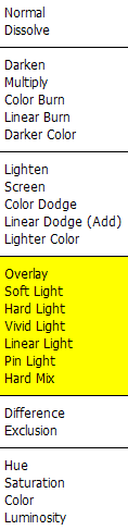
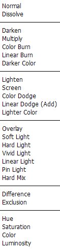
Photoshop CS3:

25 Blend Modes clearly visualized


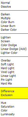
Yes, Photoshop CS3 sports a whopping 25 layer Blend Modes. That's a sizable number of often-inscrutable effects, and yet it's of great practical use to understand them all well. Or at least most of them. Hence this page.

This page is a work in progress, at present highly unfinished, as I aim to add more textual explanations.

These images are all 24-bit PNG files, so they have zero JPEG compression or other visual artifacts. They add up to over 4.5 Mb, hence this page will take some time to fully load on slower connections.

While I use the term "effect" here, Photoshop's blend modes are of course not just gimmicky effects: most of them serve vitally important functions in a great many types of color correction, retouching and compositing operations.

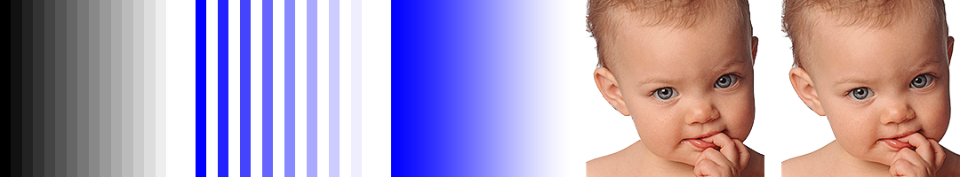
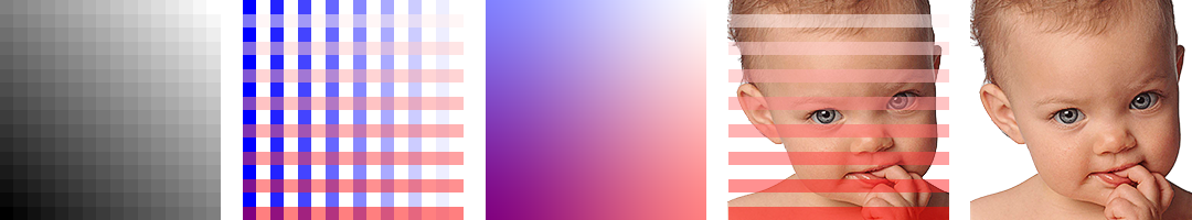
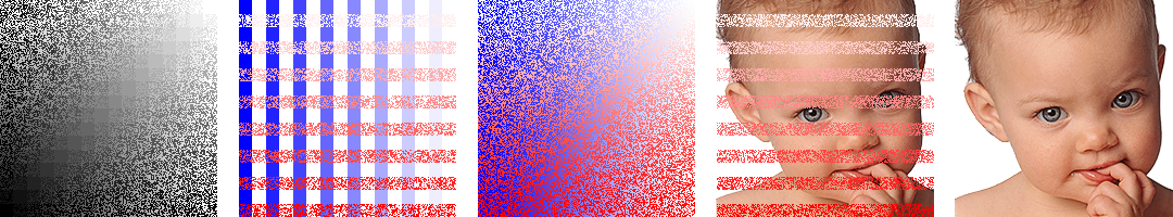
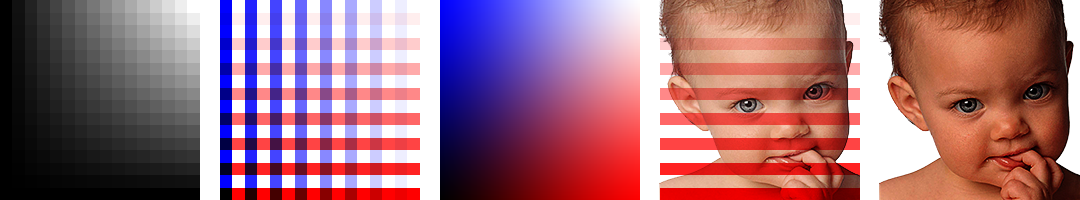
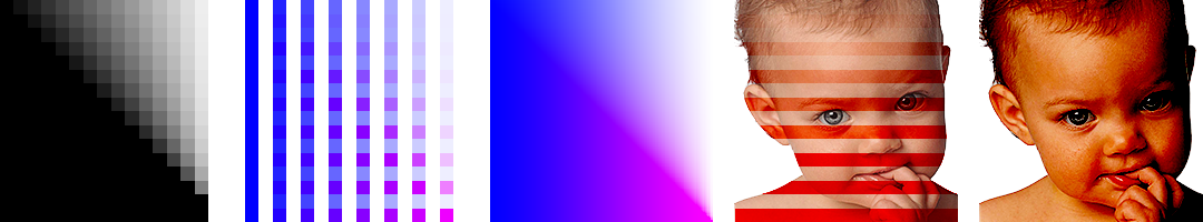
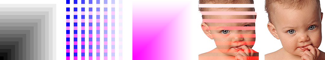
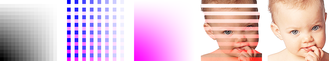
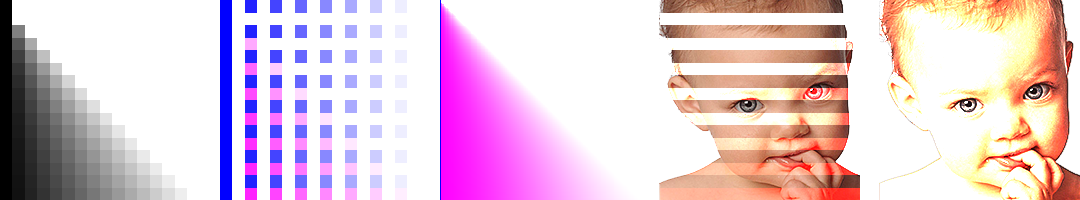
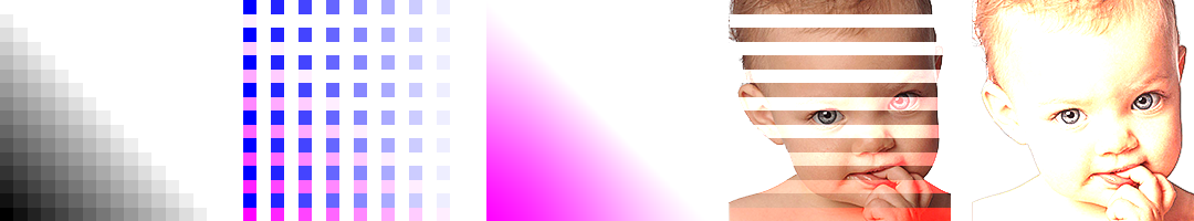
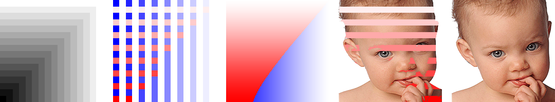
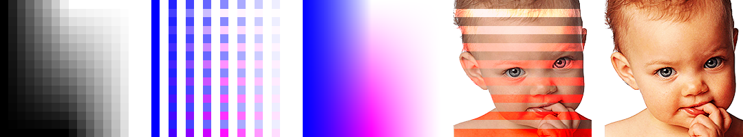
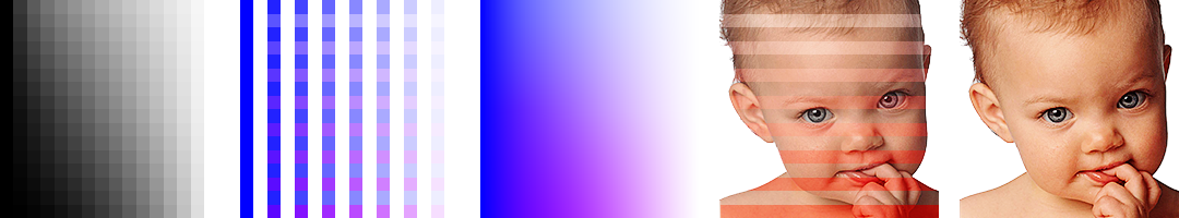
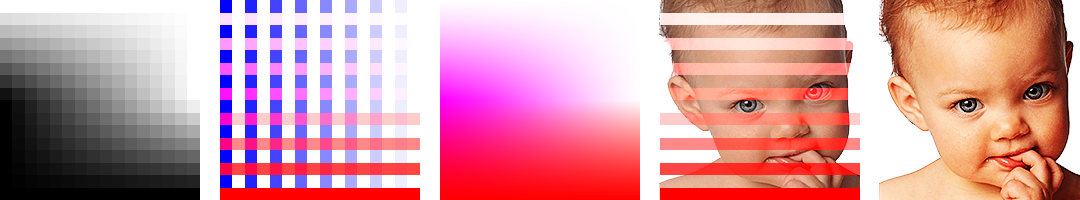
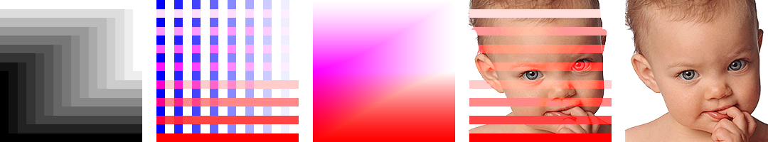
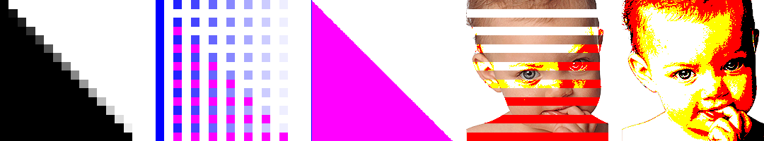
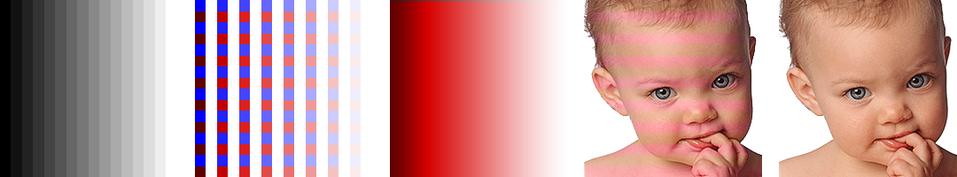
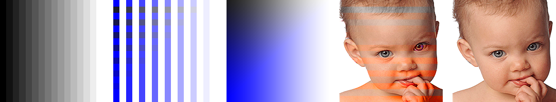
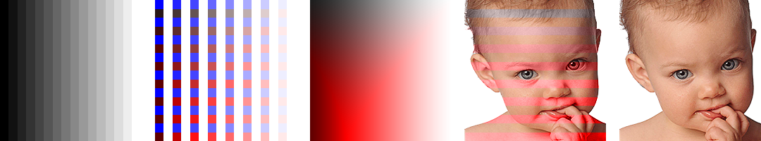
I will call this image "Blue".

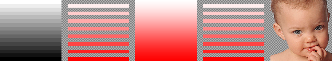
And I will call this image "Red". Note that whatever is opaque white, pink or red here is, well, opaque white, pink or red, whereas the grayish checkerboard pattern represents transparent areas in the image: pure nothing.

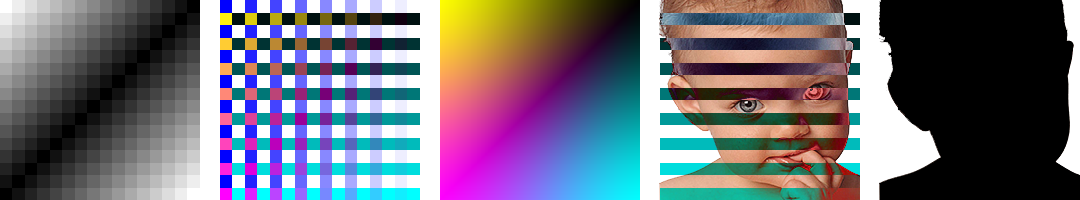
Using Blue and Red, we make a Photoshop file with two layers, containing Blue on the bottom layer and Red on the top layer. Now we will apply all the various Blend Modes to the top Red layer, so that it (taadaa!) blends with the bottom Blue layer.

Note: These examples only apply to Blend Mode effects with a file in 24-bit or 48-bit RGB mode. With CMYK, Lab or other color models, things will look somewhat different, some of the Blend Modes are not available in some other color models, etc.


The Normal Blend Modes

Normal is no blending at all. Whatever is opaque in a layer fully covers what's underneath, and any transparent parts shows what lurks below.

Normal is here set to 50% Opacity, just to demonstrate . . . exactly that.

Dissolve is here set to 50% Opacity. For it's only at Opacity settings of less than 100% that this blend mode has any effect, namely creating a random dithering of the layer. It's also a fairly silly effect, of very little practical use in image processing -- well, perhaps making Sahara sandstorms?

From now on, all blend mode demonstrations will be at 100% Opacity.


j

The Subtractive Blend Modes

s

Darken.

k

Multiply. This is a hugely useful blend mode, and one which is known to every child who's ever painted with watercolors or markers: any transparent color painted on top of another will darken the surface into the sum of both colors. It is the principle by which CMYK printing works, glazed oil colors, and all other forms of physical color mixing where at least the top color is fully transparent. (This is what color scientists call "subtractive" color mixing.)

k

Color Burn.

k

Darker Color. It is the exact opposite of Lighter Color.

 
j

The Additive Blend Modes

Lighten.

Screen. (This is what color scientists call "additive" color mixing.)

Color Dodge.

Linear Dodge (Add).

Lighter Color. It is the exact opposite of Darker Color.

 
j

The Overlay Blend Modes

Overlay.

x

Soft Light.

Hard Light.

x

Vivid Light.

x

Linear Light.

Pin Light.

Hard Mix.


j

The Difference Blend Modes

j

Difference.

j'

Exclusion.

 
j

The Chromatic Blend Modes

Hue. When using a Hue/Saturation adjustment layer to change hues (or any other hue-changing layer), it is crucial to use this blend mode in order to avoid affecting saturation or luminosity values (which the Normal default will mercilessly create).

Saturation. When using a Hue/Saturation adjustment layer to increase saturation (or any other saturation-increasing layer), it is crucial to use this blend mode in order to avoid affecting hue or luminosity values (which the Normal default will mercilessly create).

Color. In very technically precise Photoshop-terms, "Color" here means a given hue at a given saturation -- considered apart from any luminosity. In other words, "Color" does not mean what a layman means by this word, which includes also luminosity, i.e., "orange" and "brown" are two different colors in layman terms, but may well be the same "Color" in Photoshop terms.

Luminosity. When using any Curves, Levels, Brightness/Contrast or any layer intended to change tonal values, it is crucial to use this blend mode in order to avoid affecting hue or saturation values (which the Normal default will mercilessly create).